 |
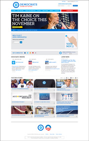
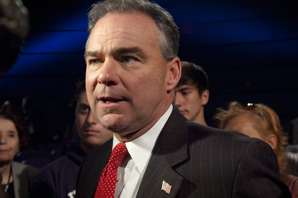
Sept. 15, 2010--DNC Chairman Tim
Kaine launched a new look for the Democratic Party in an event at The
George Washington University, including a new logo and website.
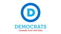
DNC Creative Director Luke Fleischer said the new look is designed to
"honor the party's history but also be very forward looking." The
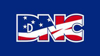
new logo, a light blue letter "D" inside a darker blue circle
replaces the old DNC with stars and stripes design, in use since the
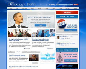
1990s. Kaine emphasized the new tools available at the
website. The new website is "geared towards personal local
action." The local experience is evident in the top part of the
site, where state and congressional candidates automatically come up
based upon the user's local IP address or by entering one's zip
code. Social media are integrated right across the middle of the
page.
|
|
|
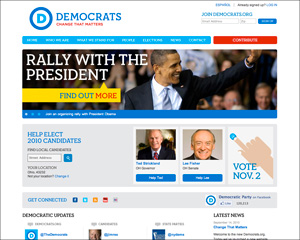
Cynics might question the
party's rebranding less than two months
before the mid-term elections, when conventional wisdom suggests
Democrats are headed for significant setbacks, but the redesign has
been in the works for months and does offer a fresh, less-crowded
look. "It wasn't about trying to redefine
ourselves so much as hone in on who
we are," stated Fleischer. Fleischer said the new website is
designed
to be "clean, simple [and] get you where you need to go." "We tried to
really strip it down," he said.
|
 |
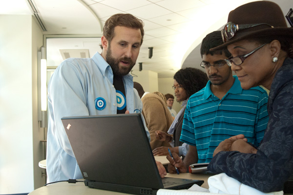
DNC New Media Director Natalie
Foster.
|
 |
DNC Creative Director Lucas
Fleischer.
|
Much of the work on the
redesign was done in house at the DNC; the New York marketing and
communications firm SS+K also contributed to the effort.
Fleischer notes that the new logo is "very spare, very minimal" and
says it is "so stripped down you can take it and own it." Whereas
the old DNC logo emphasized the committee aspect of the party, the new
"D" in a circle is more about Democrats, the people and the
party. The use of the circle also complements Obama's 2008
campaign logo, which is now used by Organizing for America. The
logo does include the traditional red, white and blue, but eschews a
stars and stripes motif or the donkey design seen on a fair number of
state Democratic web pages >.
It is somewhat generic, reminiscent of a copyright symbol. Along
with the "D" in a circle, the word
"Democrats" appears in light blue in a distinctive Neutraface Slab
typeface 1,
2
(specifically Neutra Slab Display Bold) and below that in a
smaller font size are the words
"Change that Matters" in red in the Gotham typeface made
popular by the Obama campaign. The two geometric typefaces
complement each other.
|
 |
Many GW College Democrats
attended the event. Josh Altman, president of the group said the
new look "really reflects the dynamism of the Democratic Party."
New and Improved
The DNC is
not the only party to introduce a new look and new logo in recent
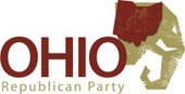
months. In
July 2010, the Ohio Republican Party introduced a new website and a
logo that
is "forward-thinking, cutting-edge, confident." >
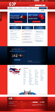
The RNC website, which was in beta form for many months, officially
launched on August 6. It has an elephant in the "O" logo, but
that design does not seem to have made a wider
appearance.
Websites of the Political Parties
|